Building a Meaningful Identity for a Patient Experience Platform

Services Provided
Brand Identity Design Language
Industry
Healthcare / Patient Experience
Solution Type
Logo & Identity System
The Opportunity
Healthcare leaders are moving toward value-based care, where experience, safety, and outcomes are deeply connected. They are not looking for another survey tool. They are looking for visibility, control, and measurable improvement.
PXB positioned itself as a partner in this transformation. The identity needed to communicate enterprise readiness, clinical credibility, and a proactive philosophy of care.
The Challenge
As trip volumes grew, ride assignments and updates over calls and WhatsApp became unsustainable. Dispatchers struggled to manage increasing demand while drivers lacked structured workflows to manage jobs efficiently.
This resulted in delays, missed updates, incomplete ride information, and inaccurate trip records. Operational control depended on human effort instead of system intelligence, leading to inconsistent service experiences and rising operational costs.
Insight to Strategy
Our discovery process focused on real care environments. Through conversations with clinicians, experience leaders, and product stakeholders, we mapped the moments where trust breaks down care transitions, unclear communication, and delayed response.


Designing the Experience Intersection
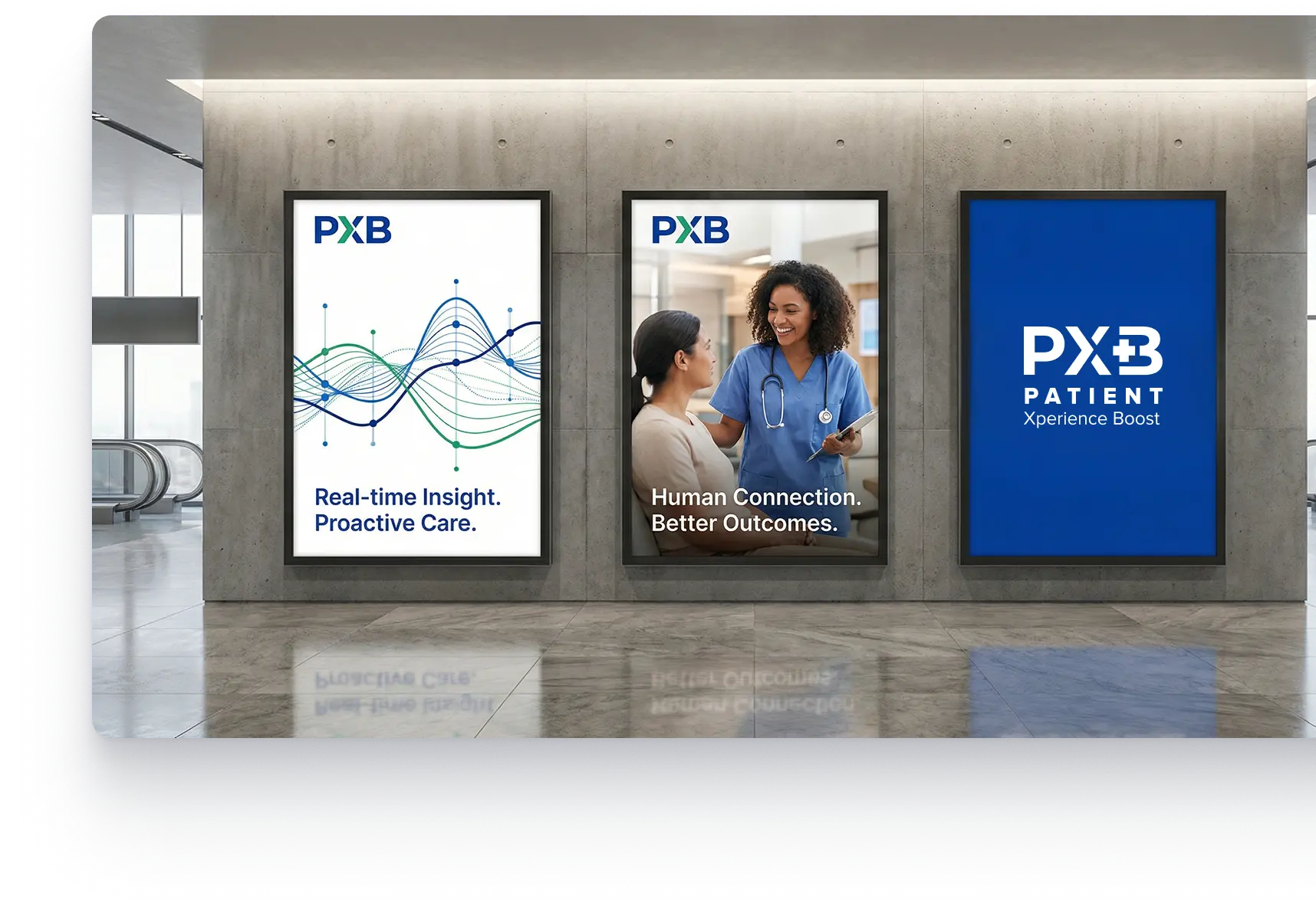
The identity was built as a system rather than a static logo. At its core, the X represents the intersection of patients, providers, and health systems. It reflects moments of listening, evaluation, and response where insight becomes action.


A Visual Language of Trust and Progress
Color and typography were treated as strategic tools.
Blue establishes security, reliability, and professionalism.
Green reinforces healing, progress, and forward movement.
Deep blue
Healing green
Primary blue
Designed for Real Healthcare Environments
The identity was built to function in real-world clinical settings, where clarity, speed, and usability are critical.


Outcome
PXB emerged as a credible and differentiated healthcare platform, positioned to support value-based care and proactive service recovery.
The brand communicates a clear promise: real-time insight, faster response, and measurable improvement.
The Impact of the Branding
Clear differentiation from survey based feedback tools
Stronger alignment between product purpose and visual identity
A scalable brand foundation ready for growth and enterprise adoption
Your Next Brand Should Do More Than Look Good
Whether you are rebranding or building from scratch, AcmeMinds creates design systems that communicate clarity, credibility, and confidence across every touchpoint.
Client Wins & Case Studies
View All Case StudiesLocal News Redesign
CMS-driven platform for faster engagement